Teaching
Jean-Philippe Lenclos’s ambition and educational philosophy are to share and pass on his practical knowledge and skills and to develop his theories on colour in greater depth, in order to teach students to create with colour. His conviction is that colour has become a major component of the environment. Colour is a vital cross-discipline, a visual element in all design, from the smallest domestic object to an entire city. From fashion to industrial design, stage design to architecture, all disciplines taught in an art school raise questions of colour.
In the first year course, my aim was to introduce students to the three key pillars of the understanding of colour: the colour wheel, contrast and colour families. These three aspects are partly based on the theories of Johannes Itten, who taught at the Bauhaus until 1923. In his teaching, Itten used the theories of Isaac Newton, who in 1666, showed that when white sunlight is projected through a prism, it splits into the colours of the spectrum. Itten also drew on the work of Michel-Eugène Chevreul, who developed important ideas about colour contrast in 1839. The foundation of my teaching was the colour wheel, which is the simplest tool for precisely identifying colours and their relationships.
Theory
↑ First year students on the colour course at École Nationale Superieure des Arts Decoratifs, Paris. 1991
↑ Students create collages from which they then create a colour wheel, comprising three rotating discs, which can be turned to generate all the possible contrasts.
↑ Each student makes a collage in a different family of colours. © Charlotte Lardinois
↑ Colour wheel of pastel tones.
↑ Use of a colour wheel in a range of pastels. © Delphine Valois
↑ Colour wheel of grey tones.
↑ Some student textile designs using a chequered pattern. The colour wheel is the basic tool used in designing a range of textiles in a particular colour family. © Laurent Dareau
↑ A colour circle of earth tones.
↑ Collage in a colour family of earth tones, and the corresponding colour wheel. © Stéphanie Pacart
Project: design a pattern
↑ The colour wheel is the basis of an understanding of colour. Students make a colour wheel in a particular colour family, such as pastels, bright colours or greys. © Elise Muchir
↑ The different stages of an exercise to create a design for a silk scarf on the theme of butterflies. This example shows, from top left corner, a collage to create a colour family and, next to it, the colour wheel drawn from the collage. Underneath is a study of butterflies and a translation of this into black and white. On the right are the designs based on this study and a chromatic range for the scarf in the same colour family. And finally, a scale creation of the silk scarf. © Dorothée Volut
↑ Second example of student’s work for this project, this time in earth tones. © Alice Taylor
Project: still life in watercolour
↑ Many painters have practised painting flowers, which is a perfect exercise for studying the colours of nature. Students paint a study of a bouquet of flowers in a single morning, exploring their individual perceptions of colour and their own style.
↑ Student’s watercolour study of flowers.
↑ Studies in pattern making based on the student’s still life paintings. ©Damien Laurens
↑ A student’s watercolour study of flowers. © Chloé Jumeau-Lafond, 2002
Project: colour in 3D
↑ This stage is about moving from 2D to 3D. It starts with work on a graphic rhythm in black and white, which is then applied to three 3D shapes forming an abstract architectural whole.
↑ Each student applies the black and white graphic motif to the 3D forms.
↑ The motifs are then created in a colour family designed to respect the colour range of a natural environment. This study also introduces students to colour perception in relation to space.
↑ Single design shown in colour and black and white. © Souhail Matouk
Project: space and colour
↑ Students then work on a colour version of the same composition, in 2D and 3D.
↑ Painting of a very colourful, imaginary urban landscape. © Nicolas Hermlé
↑ Model in a box of a very colourful, imaginary urban landscape. © Nicolas Hermlé
↑ Collection of students’ urban landscape models.
Project: the polychrome city
↑ The polychrome city. This utopian vision of the city was a project adopted by Fernand Léger in the early 1920s. It is a three-dimensional exercise that gives students an opportunity to use colour on a monumental scale. Each student builds a housing block like a sculpture, initially in white and then, having made a few sketches, introducing the colours of the spectrum. © Claire Laude
↑ Next, the students build a model based on their sketch. © Claire Laude
↑ And finally, they present their model on a neutral background. This model is shown with a version in white too. © Claire Laude
↑ When all the models are grouped together, the utopian vision of the polychrome city becomes a reality.
Project: industrial landscape
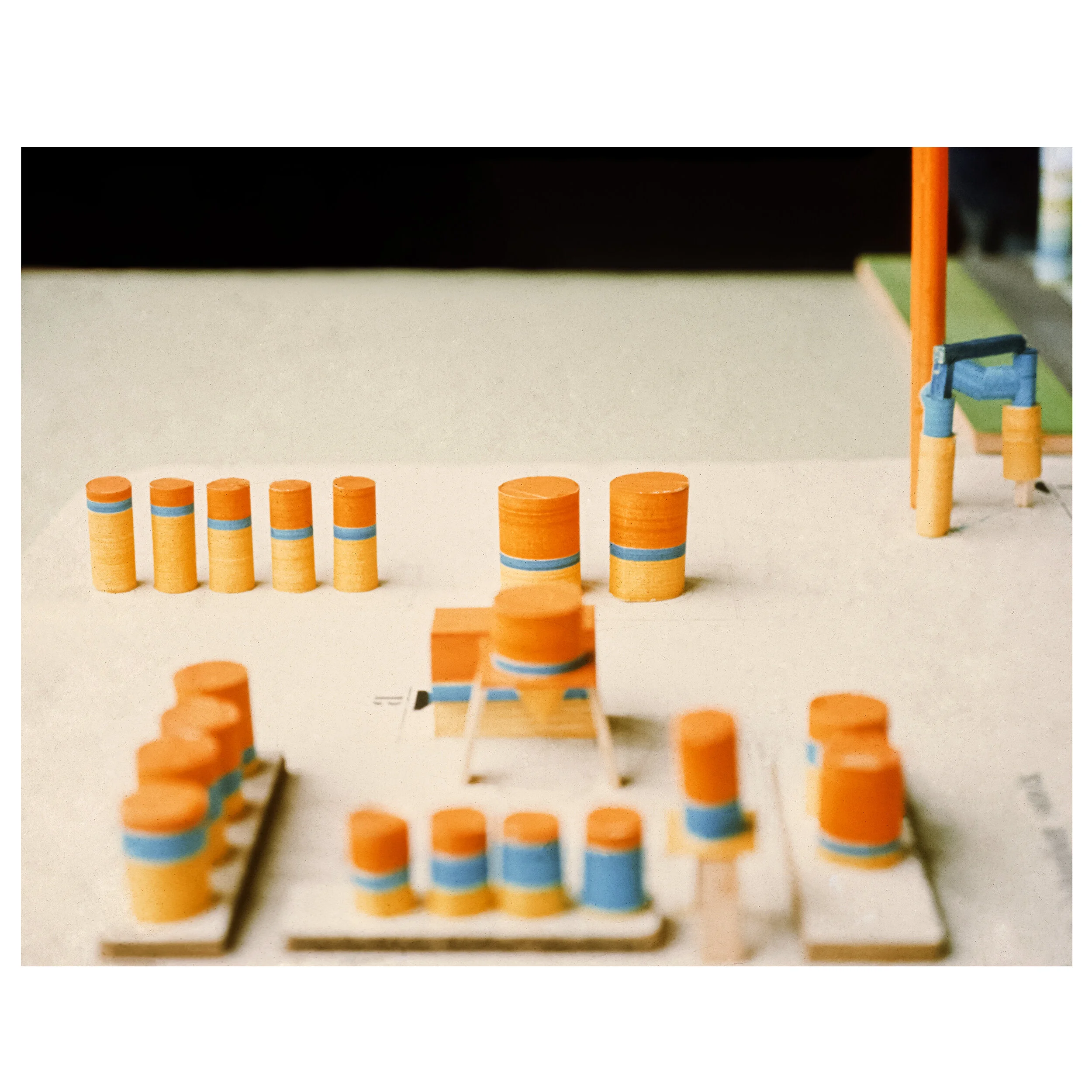
↑ Colour in the industrial landscape. Here students work on colour for storage towers at a hydrocarbon factory. The factory is located near a new urban site and the student brief is to design a dynamic, innovative visual identity and at the same time to give local people a playful, colourful architectural landscape.
↑ Design in cold colours.
↑ Design in warm colours.
↑ Design in a mixture of colours.
We regret that due to incomplete archives, it has not been possible to identify all of the student’s whose work is shown here. If you recognise your work or the work of another student, please contact us here so that we can include their names in the copyright notice.


