
Atelier 3D Couleur
After having worked independently for ten years, Lenclos opened his own agency in 1978, Atelier 3D Couleur. They specialised in the research and study of colour used in architecture, urban design and industrial product design. Their first projects were for industrial machinery and architecture, and housing developments. The studio also developed work in consumer goods such as electrical appliances, transport, sports equipment, building and decorating products, cosmetics and furnishing textiles.
Urban architecture

↑ Colour inventory for the façades of vernacular architecture in France. All the shades are formed of nuances dominated by the natural mineral pigment ferrous oxide. 1978

↑ Les Linandes. Housing development in the new town of Cergy-Pontoise, comprising 300 dwellings. Architects: J.F. Jodry, J.P. Viguier. The colour range reflects the mineral hues of this region near Paris. 1976

↑ Les Linandes. Paint test for facade and framework colours. Ten were chosen for the whole palette, with four of these chosen for the framework (doors and windows). 1976

↑ Les Linandes. Housing development in the new town of Cergy-Pontoise. Architects: J.F. Jodry, J.P. Viguier. The colour range reflects the mineral hues of this region near Paris. The colour palette is divided into two sections: the general palette of ten tones for the facades, and the detail palette of four tones for the window and door frames. 1976

↑ The old town of Saint Germain-en-Laye, which underwent a project of renovation in 1982.

↑ This colour synthesis was produced after surveying the facades of key buildings in the town. Saint-Germain-en-Laye. 1982

↑ Colour chart for the renovation of building facades, in line with the town’s heritage. These four colour palettes were proposed for the renovation of the oldest district in Saint-Germain-en-Laye. The colours would be used for shutters, walls, roof tiles and doors. 1982

↑ This illustration, made with cut paper, shows the colours in four architectural sequences in the protected area of Saint-Germain-en-Laye. Above is a simplified representation of the 17th century hotels situated next to the chateau. Below are some of the facades of houses in the market place. These narrow streets of housing are characterised by more colourful facades. The masonry is a composite similar to that used in Rue de Noailles.

↑ Colour chart for Saint-Germain-en-Laye. The aim was to give the inhabitants some basic rules to follow in order to respect the colours of their town’s heritage. This poster, which was put up in all pubic spaces, was intended to inform and raise awareness among residents whose buildings were undergoing restoration. Residents could chose from the palettes and examples shown. 1982

↑ The French Academy in Rome, La Villa Médicis. View of the facade facing the garden, before renovation. A study led by the Head Architect for Historic Monuments, Jean-Loup Roubert. Colour study for the renovation of the facades of this prestigious 16th-century building. The final choice was for the powdered marble white used in the original construction. 1992

↑ The French Academy, La Villa Médicis. (Musée National d'Art Moderne, Centre Pompidou, Paris.) A study proposing a treatment using fresco technique with vertical stripes in three shades: cold white, neutral white and warm white. 1992

↑ Interior façade of the Villa Médicis, overlooking the gardens. (Musée National d'Art Moderne, Centre Pompidou, Paris.) 1992

↑ Colour chart for the renovation of the town of Épernay. The chart serves several purposes, including harmonising the colours of the town, making it more attractive to tourists and giving the inhabitants a practical guide for choosing their own coordinated colours for their buildings. 1980

↑ Colour chart for the renovation of the facades of Côteaux Ouest in the town of Épernay. 1980

↑ Colour chart for the renovation of the facades of the old city in the town of Épernay. 1980

↑ Social housing in Campagne Lévêque, Marseille. (Musée National d'Art Moderne, Centre Pompidou, Paris.) Preliminary study in black and white showing the many rhythmic possibilities of the structures of the facade. 1974

↑ Social housing in Campagne Lévêque, Marseille. (Musée National d'Art Moderne, Centre Pompidou, Paris.) Several examples of proposals based on the black and white study, showing simple and more complex colour variations for the facades. 1974

↑ Colour study for the renovation of social housing in Campagne Lévêque, Marseille, made as part of the multidisciplinary Urbame team. 1974. This facade of the whole block has a rhythmic structure of vertical stripes for the stairwells, regularly punctuated by windows. Our first sketches developed the theme of a huge coloured tapestry on an urban scale.
Industrial architecture

↑ Solmer steelworks in Fos-sur-Mer. (Musée National d'Art Moderne, Centre Pompidou, Paris.) Colour project for a blast furnace. The choice of colours for the anti-corrosion paint were defined by two requirements: to describe the respective functions of the different structures, and to add an aesthetic dimension to the structure so that it better connects to the human scale of the workers. 1975-1977

↑ Solmer steelworks in Fos-sur-Mer. Blast furnace, complete in new colour scheme. 1975-1977

↑ Loading crane. Solmer steelworks in Fos-sur-Mer. This industrial complex was built in a deserted spot well away from any built-up area, enabling us to make free use of a palette of bright colours. Here the colours have a functional role in identifying the main parts of the giant machines. 1975-1977

↑ AGA factory. First sketches for the colour research. Coloured pencil. (Musée National d'Art Moderne, Centre Pompidou, Paris.) 1969

↑ AGA factory, Limay Porcheville, région parisienne. Storage tanks for liquid gas. 1969-1971

↑ AGA factory, Limay Porcheville, région parisienne. Five colours have been used to give an identity to this liquid gas production factory, making it stand out clearly in a vast industrial zone. 1969-1971
Transport

↑ Marseille underground, St. Charles station. Project to create a colour identity for the twelve stations of Line One. Yellow has been chosen as the identification colour for this station. 1975

↑ Marseille underground, St. Charles station. Each station is identified with a colour of the palette chosen for this metro line’s signage. 1975

↑ Marseille underground. The complete colour palette for the identity of Line One. 1975

↑ Renault automobiles. Development of a colour chart for urban vehicles. This colour study required three to four years of laboratory research. L’Atelier 3D Couleur was commissioned by the Director of Design at the Renault Group to create a colour research unit for the study of materials used in vehicle production. 1978-1981

↑ Renault automobiles. Development of a colour chart for urban vehicles. The colour study required three to four years of laboratory research. This chart reflects the need to coordinate the paint on the external bodywork with the colours of the interior. 1978-1981

↑ Renault automobiles. Provisional exhaustive colour swatch for vehicle bodywork. Created for the range of Renault vehicles destined for the French and international markets between 1985 and 1990. This approach enabled the laboratory to research the most appropriate pigments for the long term.

↑ Renault automobiles. Colour and materials study for the interior of a limited edition range of cars.

↑ Renault automobiles. An extract of the design scheme, showing a breakdown of the colour combinations proposed for this year’s models. 1984

↑ Renault automobiles. Presentation of bodywork colours for future models. The industrial process limits the number and quantity of colours that can be used. The colour choices need to meet the demands of the market segments for international and domestic customers. There are also different finishes available, such as metallic paints and varying opacities.
Consumer products

↑ Study for the promotion of colours in sportswear, based on current fashion trends. The aim was to anticipate trends and individualise brands. Created before the days of computers, these collages were all done by hand. 1970

↑ DMC, embroidery thread. Redesign of the colour range for the international market. This study addressed clients who were very attached to their traditional use of colour. It represented a new application of the concept geography of colour. 1980

↑ Analysis of trends in the interior design sector in the 1980s. Each vignette shows different furnishings and interior decoration, such as curtains, rugs, tables and sofas. Each year three or four colour schemes are published. The styles and colours of each scheme are influenced by cultural or sociological trends that have become influential across the world. Trends vary from the ephemeral to something can that last for three or four years. 1981

↑ The styles natural, op art, Stendhal and Burlington. 1984

↑ The styles asiatic, graphic, deco and Scottish. 1994

↑ The styles Pacific, sun, Shanghai and Santa Fé.

↑ The styles jardin, blue jean, high tech et safari.

↑ Philips, twelve Ladyshave razors. The colours correspond to the market sector and price level. The colours also allow national companies to make different offers in each of their shops. 1990

↑ Philips LadyShave in its matching presentation case. This model was aimed at the luxury market. 1990

↑ Salomon. Coloured pencil drawings of designs for a range of hiking boots.
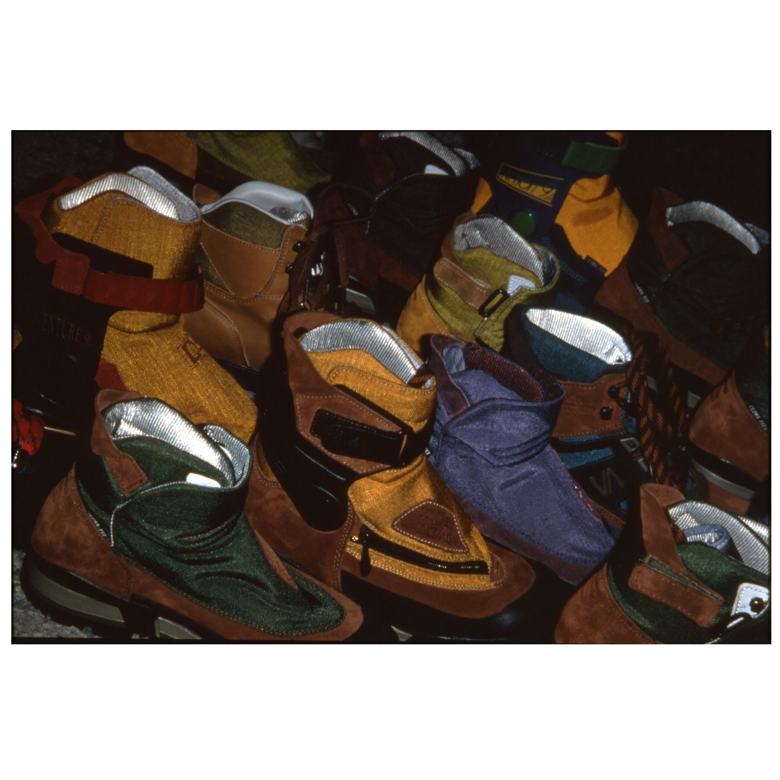
↑ Salomon hiking boots. The colours of this range differentiate market segments by customer profile and distribution outlet.

↑ Salomon. Analysis of twenty-four designs for ski boots to be launched in 1985. There are two types in the range; men and women, and three levels; leisure, sport and competition. The choice of colour contrast gives each level a distinct look. For example, the competition range has the strongest contrast, with a consistent use of black to give a technical feel. The warm and bright colours, yellow, orange and red, bring the dynamic and active feel of performance. The softer colours are aimed at the women’s market. The three panels at the top show the competing products in this market.