
Early career
After studying at École Boulle, École Nationale Supérieure des Arts Décoratifs in Paris and École des Beaux Arts in Kyoto, Jean-Philippe Lenclos began his professional career as Artistic Director at Peintures Gauthier, a company specialising in paints for outdoor use. This introduction to the world of industry, where he studied colour schemes for various products, would determine the direction of his future work researching colour for architecture and industrial products.

↑ Peintures Gauthier. Can of paint for use in construction. The development of a new brand identity focused on cans for paints used in the construction industry. This design was one of the first to adopt supergraphics. 1965

↑ Peintures Gauthier. Cans of paint. The geometrical model with infinite variations gave a highly dynamic expression of the brand identify when the tins were stacked. 1965

↑ New colour swatch for interior high gloss paints. The range of acrylic paints in the Neopakol range includes 95 colours. 1966

↑ Peintures Gauthier. First of three posters showing the brand’s new corporate identity. These posters were sent to architects to promote the new brand of paints, Peintures Gauthier. The G logo design is shown here in its base purple and white version. 1965.

↑ Peintures Gauthier. Second of three posters showing the brand’s new corporate identity. Here the G logo design is shown in four colour variations. 1965.

↑ Peintures Gauthier. Third of three posters showing the brand’s new corporate identity. Here the G logo design is shown with two product sub-brands. 1965.

↑ Peintures Gauthier. Four designs for product sub-brands. 1965
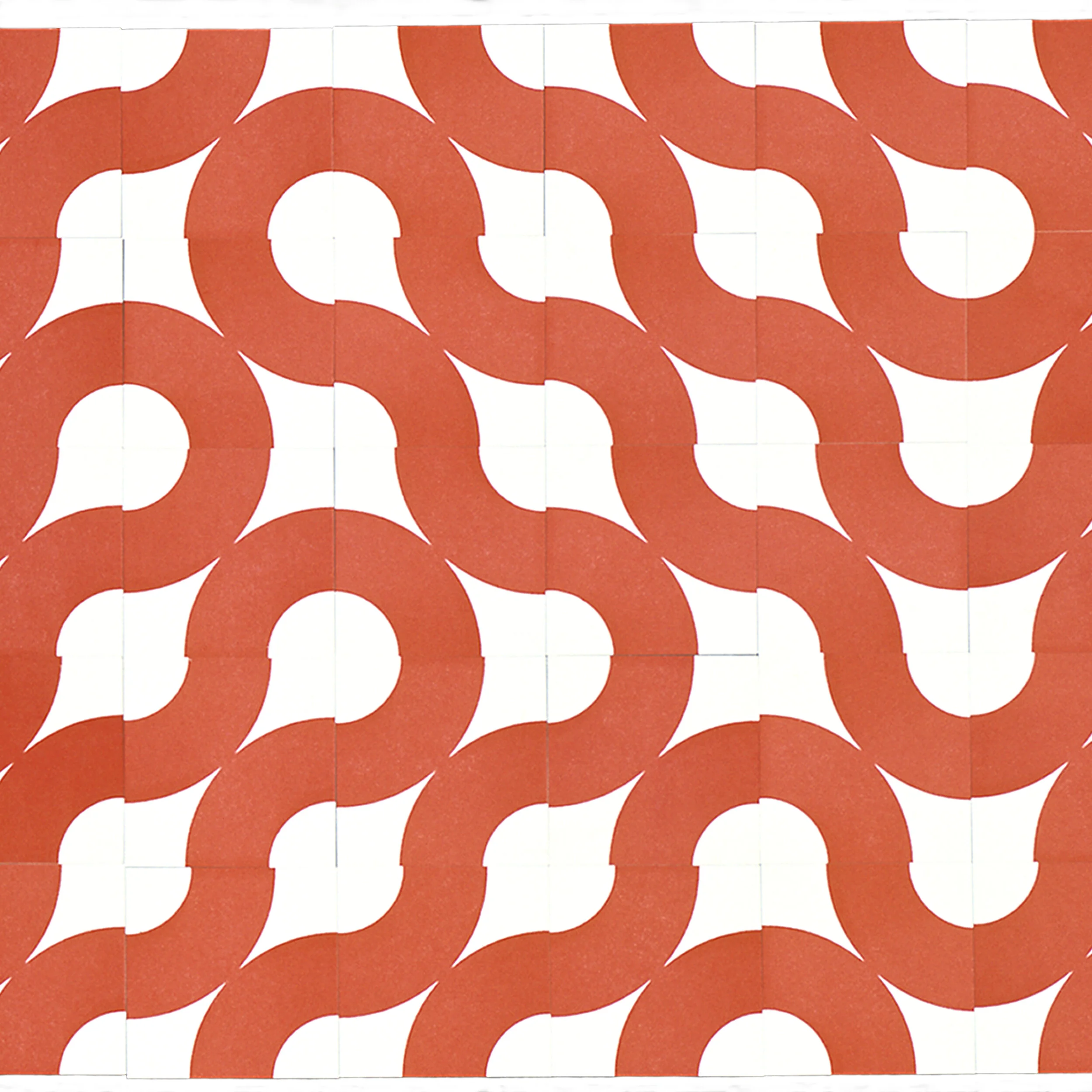
↑ Supergraphic design for paint cans. This motif was used in a variety of marketing materials for the Textone range of masonry paints. Its geometric design allows for an infinite number of layouts to be built on the basic motif. This design became included in the movement of supergraphism. 1966

↑ Supergraphic design for paint cans. This design for the paint brand Neoprim extends out from one can to another. 1966

↑ This Gauthier paint guide shows regional colour schemes for building facades. The brochure includes practical examples for the application of the geography of colour method. It highlights the concept that each region and each geographic location are characterised by their own unique colours. 1998
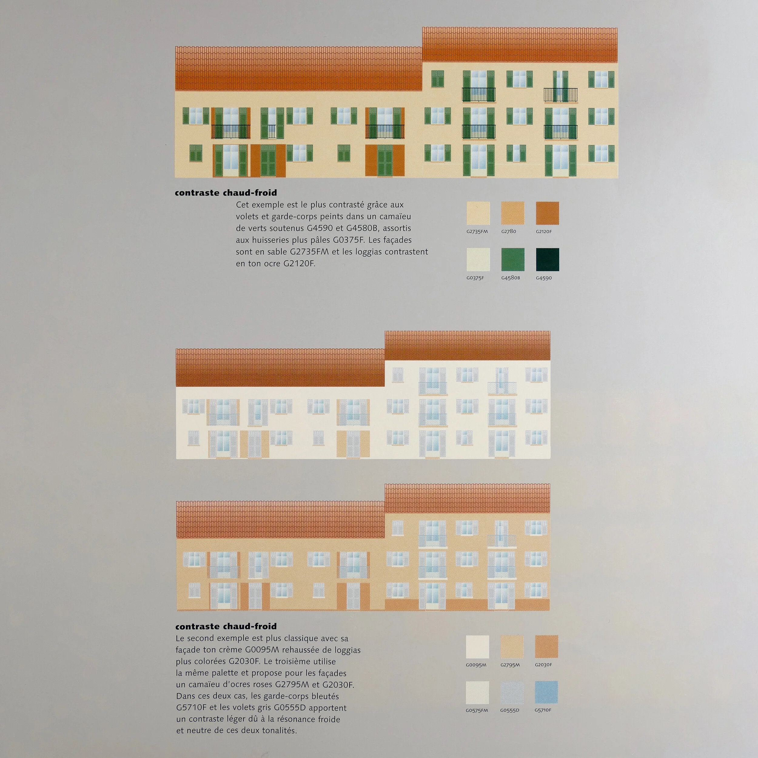
↑ Warm/cold contrasts. Top, an example of a more contrasted design, with shutters and railings painted in a gradient of deep greens, paired with fittings in a paler shade. The sand-coloured facades are contrasted by the covered balconies in ochre tones. In the centre, a more classic example with a cream facade enhanced by more colourful balconies. And below, the same palette for the facades in a gradient of pink ochres. In these two lower examples, the bluish railings and the grey shutters bring a light contrast in response to the cold and neutral tones.

↑ Top, facade in an elegant range of warm pink ochre shades, on a bold base of brown ochre. The rose white of the facade creates a harmony with the pink ochre of the covered balconies. The white shutters and the railings in bordeaux red bring a classic note. Below, a contrast of hot and cold colours. The shades of yellow ochre, ranging from light to dark across the facade. The principal colour is a white ochre, against which the white shutters stand out. The balconies are underlined by an intense yellow ochre, similar to the base colour. The bright green railings add a lively, cold note.

↑ Top, facade with a warm, delicate gradient. The whitish grey of the facade and the base colour of stone grey are accompanied by a basalt grey. The warm tones of the rose grey shutters and the reddish brown railings create a subtle harmony of greys. The two lower examples use a yellow ochre for the base and balconies, with colder tones of almond green for the shutters and a dark green for the railings. The only change is the use of a very luminous white ochre for the middle design and a light pink ochre, closer to the colour of the balconies, for the lower design.

↑ Top, a contrasting, warm gradient. The facades are composed from a two tone palette of beige and cream. The balconies are in a gradient of darker sandy shades. To sharpen this harmony, the doors and railings are in a reddish brown. Below is a more sparing design. The facade is predominantly cream, with some verticals of light sand that play with the deeper sand gradients on the balconies. Two tones of blue, light on the doors and dark on the railings, bring an occasional, contrasting accent.

↑ Left, warm gradients. Dominant tones of light yellow ochre on the facade, with two verticals of a darker orange ochre to balance the horizontal ledges in the same colour. The balconies and the substructure are in a darker ochre. The white woodwork and beige balconies complete this gradient. On the right a more sparing design that changes the appearance of the tower so completely that it’s hard to believe the two designs are for identical towers. The white facade is enhanced by two soft ochre verticals. The sober style of the grey balconies and substructure is livened up by the pale green of the woodwork and the mid green of the railings.

↑ Colour space at the Milan Biennale, Italy. The aim of this display was to show the technical and chromatic strengths of the new colour chart of high-gloss paints, used for prestigious projects. 1969