Interior design
Jean-Philippe Lenclos’s studies at École Boulle and École des Arts Décoratifs were focussed on architectural interiors. He researched the ways in which colour could transform the interior space and he has regularly taught colour in the architectural environment at École des Arts Décoratifs.
Photo: Commission by Elle magazine for an interior decoration for a living room, exhibited at the Salon des Artiste Décorateurs in 1968.
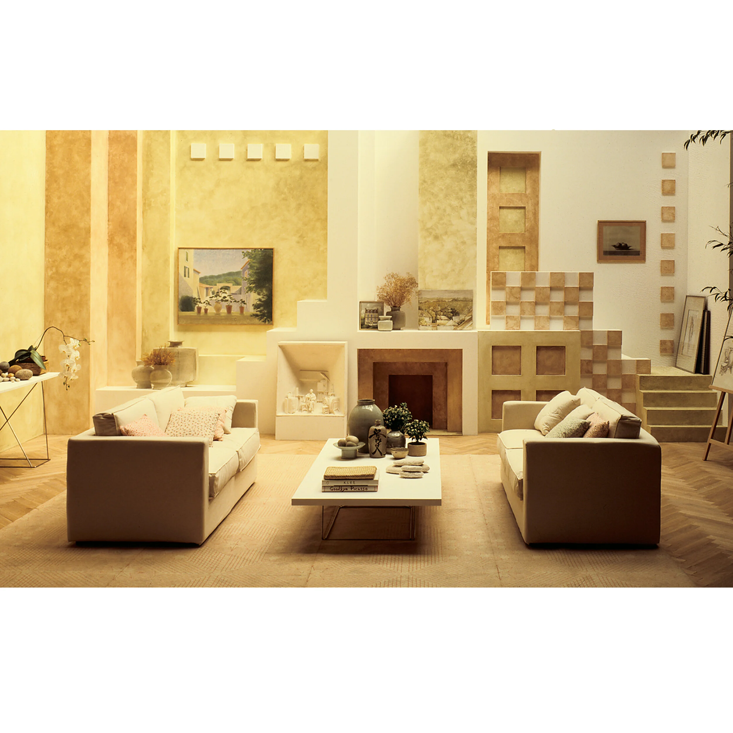
↑ Living room in an apartment, published in Maison de Marie-Claire magazine. The aim was to promote a new use of colour in interior decoration. We can see that the range of colours is similar to that of the painting Landscape in Saint Corentin. 1977
↑ Painting in oil on wood panel. 41.5cm x 56cm. Landscape in Saint Corentin. A gentle and homogeneous palette of light colours, used in half tones, conveys the rural habitat of this region outside Paris. I have painted scenes like this from life or in my studio throughout my working life as a designer. 1968
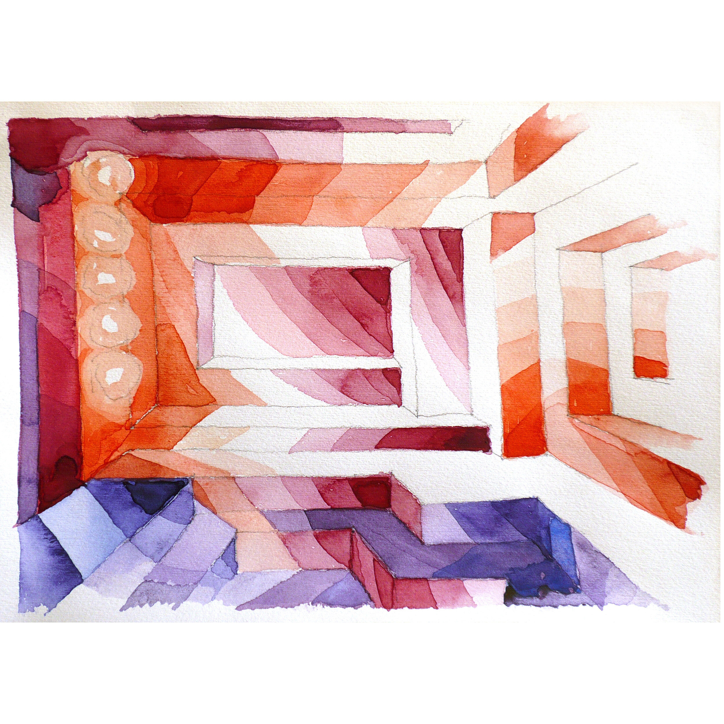
↑ Watercolour. 21 x 29.7cm. (Musée National d'Art Moderne, Centre Pompidou, Paris.) Preparatory drawing showing the impact of colour in a supergraphic that transforms the interior shapes. 1967
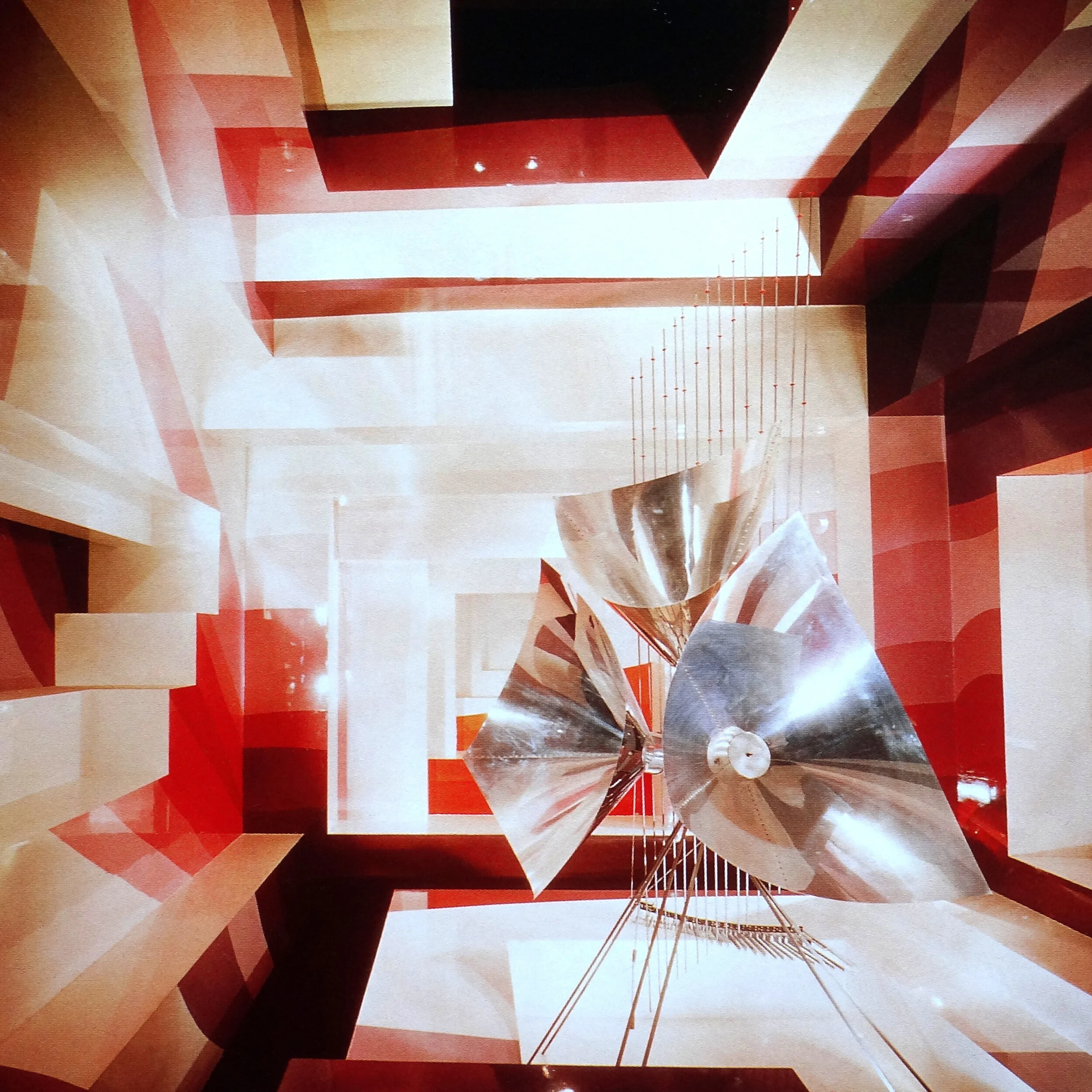
↑ Auditorium. This interior is designed as a habitable sculpture. It has programmable lighting which changes the sense of space. Changes of colour and shade across the interior ‘supergraphic’ forms is balanced with areas of white. To heighten the effect, surfaces have been treated with reflective varnish. In the centre is a sound sculpture by the Baschet Brothers, makers of futuristic instruments. 1967
↑ Watercolour. 21 x 29cm. Design for the corner of a living room. This project was a commission from the interior design section of Elle magazine. 1968
↑ Watercolour. Musée National d'Art Moderne, Centre Pompidou, Paris. Corner of an apartment living room decorated with a supergraphic in cold colours. 1968
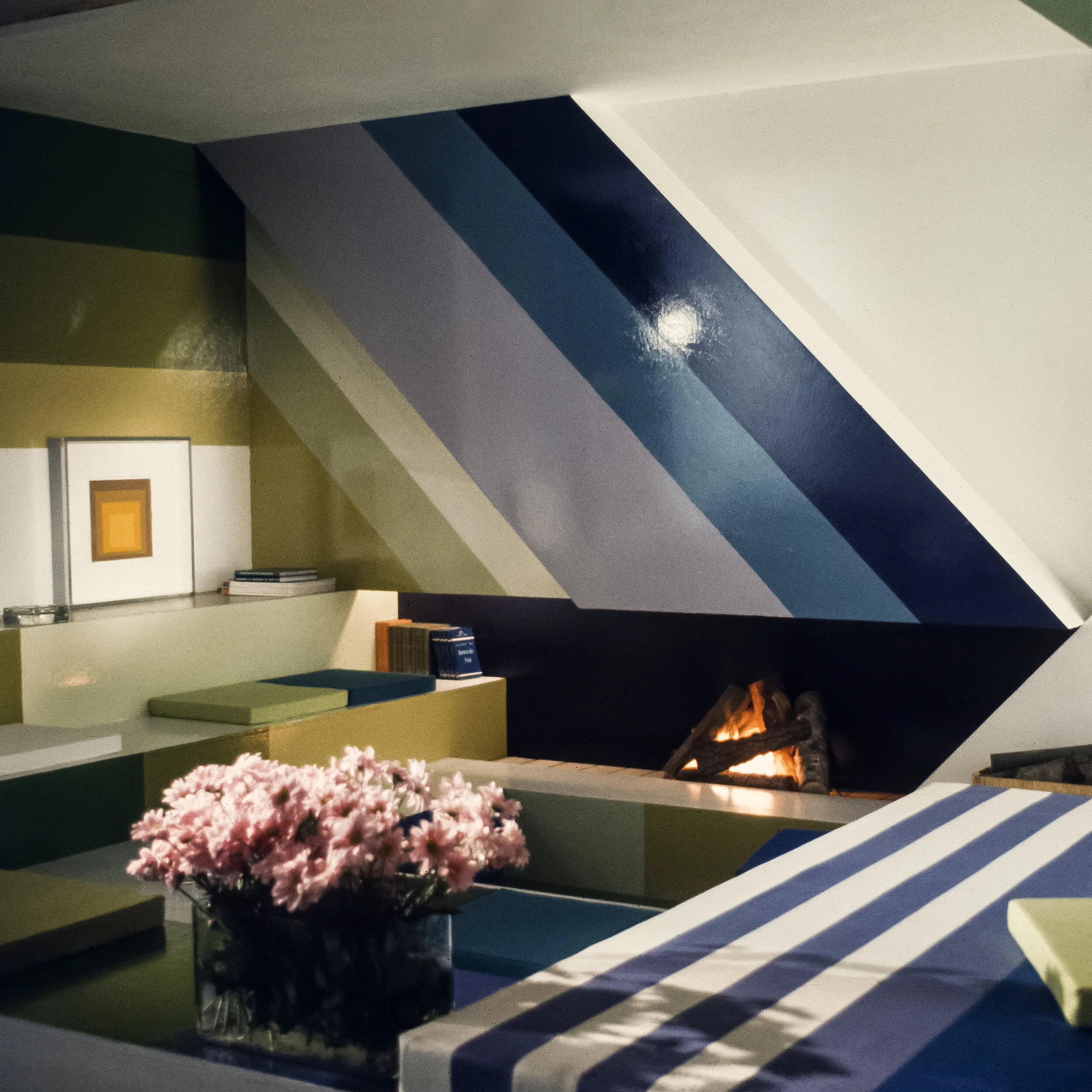
↑ Apartment living room with log fire, decorated with a supergraphic. The magazine Elle Decoration wanted to show its readers the ways in which supergraphism could be used in interior decoration. 1968
↑ Sketch of a supergraphic in coloured pencils for a design of the entrance to Jean-Claude Bernard’s architecture agency l’Arc in Paris. 1975
↑ Entrance to the architectural firm L’Arc. Supergraphic decorating the office entrance of the architect Jean-Claude Bernard. 1975
↑ Colour graphic mural for a foyer in the building for young workers in the town of Vaudreuil.


